Bought 5 tickets for the Powerball… if I win, JGO is getting a nice donation so that it can be cared for properly by Riven (or whoever). I need to stop daydreaming and get back to work… sigh
Task I declared I would finish on Sunday was complete yesterday morning on bus to work, and formatted for posting here just now.
On to integrating the new functionality for writing audio to my ShepardChord generator! Maybe I can get that posted today (might be ambitious, will require modifying for stereo, testing).
Finished writing a true type font renderer in Java. What I thought would be something fairly simple turned out to be a much larger project. For those that don’t know the true type font comes with its own language which is defined by op codes. The op codes allow you (the font creator) to program how best to grid fit the font at different sizes so that when you draw the pixels you get text that doesn’t have gaps in (more for very small text).
I now have something that builds a font object directly (texture, glyph data etc) and can render it in my 2D ui components!
It doesn’t currently do anti aliasing, it only grid fits so I might add that later. I also want to see if I can write a shader to render the the font characters directly (ie skip the whole texture generation stage), I can already draw the font outlines in 3d so not too much of a step forward from there.
One interesting thing I noticed was the formula for working out the initial grid positions. It uses the dpi of your monitor to convert font coordinates to screen coordinates, the old documentation from Microsoft talks about the old VGA monitor days where VGA was seen as 96 dpi. But when drawing the characters I noticed that 96dpi seems to be the default number all the renders use. I originally put in the actual dpi of my monitor (around 165dpi) and the characters look much bigger that they normally do.
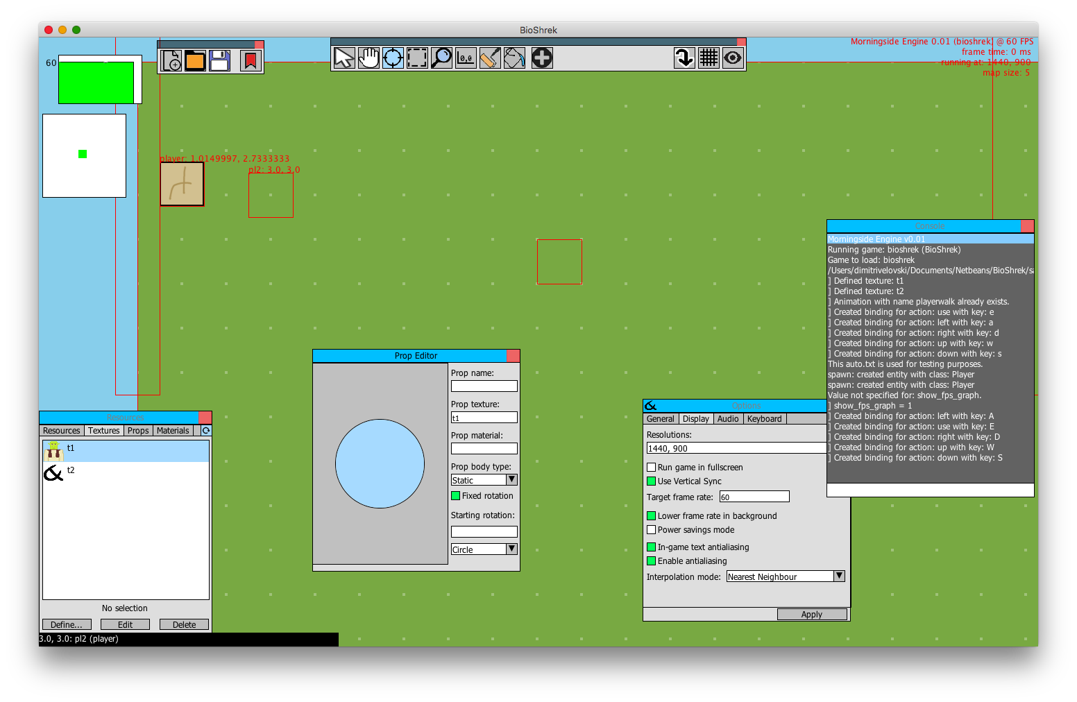
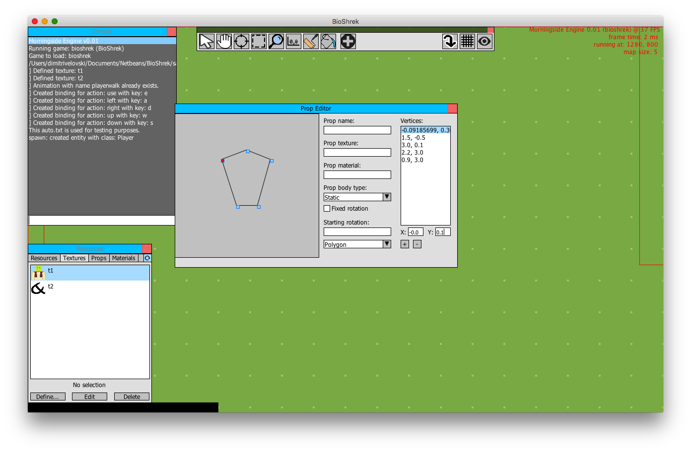
Progress is slow but I’ve been implementing a prop/model editor into my game engine:
I rolled a custom ‘window manager’ to help me build UI within the engine’s various components, basically everything you can see there is built off that (except for the map itself) and it’s come a long way from when I started it. I’m persevering with Java2D for now, it hasn’t posed too much of a problem as the engine’s grown.
Tried an experiment last night - I’m seeing how advertising on JGO will affect my Headline Benchmark site traffic. So far I’m winning bids on EU and US airtime.
@basil_: you should try exhibit your art, it’s beautiful.
It’s dirty cheap! $0.05 / day for an exclusive slot!
You should make 1080p wallpapers for these, they’re beautiful.
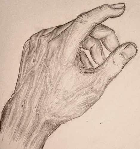
Drew my left hand:
Turned out pretty solid - now on to the right one for a challenge - it will probably hold a pen, though… 
Started a new game about a baby who wants to learn more about graphs and reach cookies 
So many projects O_O
and so low downloads on google play
1 000–5 000
Maybe try make PC version and post on Steam - for 1-2 $ or free
in any case better then google play 5k downloads free
Made my draggable window resizable, too, today. Baby steps. It’s pretty slick.
Cas 
Looks good! I’d suggest focusing on contrast in shading, and smoothing it out a little bit. Don’t draw in the lines so thick, remember that a shape is defined by light, not dark. A sudden change in darkness of the graphite denotes a sharp edge. You’ve definitely got the shape part down though!
For the bits that are a little more awkward to draw, look at the shapes they make. Don’t think ‘this is a finger’, think ‘ok this here is a triangle of these proportions, which is overlapped by this line here’, etc. It’ll help with those fingers in the background.
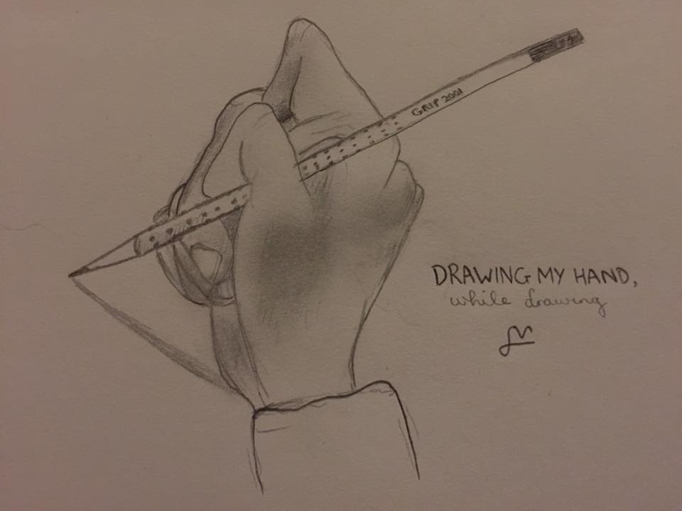
@cylab: I did that yesterday too (promise I didn’t copy you):
Interesting to see different art styles, I normally draw photorealism from photos but I wanted to try something different.
More engine-related stuff, I’m working on polygon model support for my model editor and it’s coming along decently.
Next is to add support for instantiating props in the game world. Try not to look at the awful frame rate, my laptop was on 2% and throttling horribly.
Hello everyone! 
I registered at this awesome site and set up my profile.
Now browsing old posts and stuff 
Actually I like the thick outlines as a “style”
I usually do with my “smear finger”, but in this case I avoided it by purpose, unfortunately excessive eraser usage screwed this up a little  Nevertheless I need to practice hatching techniques
This is a good advice, appreciated! :point:
It would make a nice experiment to stylize a drawing to only use a subset of geometric shapes…
Ah, I was thinking you were going for a realistic drawing (damn, that sounds snobby, I mean as in trying to perfectly model the shading of real life. Still doesn’t sound good… dammit. No ill meaning implied there, ok?). In that case, to refine your style that you like, maybe try making your lines a little less ‘sketchy’. Do it first with a hard pencil (so it’s soft and thin), then go over it once with a darker pencil. This will give you a clean look, with the thick lines you like.
And about the shading, I highly suggest not smudging your drawing. This pushes it into the paper, and makes it difficult to erase later if you want to change something. Instead, use light circling, or cross hatching, or just one directional shading with an ebony pencil or something similar. It looks cleaner, doesn’t dirty your finger, and allows you to introduce finer detail.
aaah, i was hoping to see some motion-blur-drawings 
YES! Exactly this! I love (really) thick, black outlines!
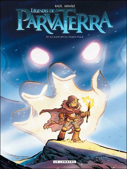
This here is a (Belgian, unfortunately) cover from a comic book series I get my inspiration from when I draw; I personally find it awesome and you should definitely check it out if you can understand basic French (although I’d say It’s worth it even if you do not read French, heheh).
That was the free advertising moment of the day! J0, I’m out. 

