What I did today

Can I start this back up again? It was fun, also provided motivation to do something, anything productive on an otherwise crap day.
Not sure it should be in CM, we did have some good talk going last time that might be useful to people of the future…

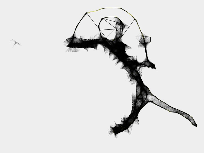
Anyway, experimenting with “smart” brushes inspired by project harmony:

Might try to have to generative art in my planned game…

Dang, that’s cool. I’m gonna guess you used some kind of stencil class?

Dunno what you mean by that, but it’s just points:

http://pastebin.java-gaming.org/c6f303c8392

Awesome! Now I can become a professional artist.

This is awesome. Nice and short code too.

Even better (if you’re on windows) is Krita

Drew this in about a minute flat, no skill really required:

Similar but more limited: http://weavesilk.com/

Added slight support for colors. This is a man running with yellow electric powers i guess.

I did this today:

http://sixtygig.com/junk/topMedals1.png

Riven be 'slackin!

Sadly I have nothing to show today that wouldn’t look like shameless plugging of my project since it’s all Castles related. :confused:

Second day of working on my new project, Viking Dodge for JumpButton Studios:


(Didn’t use imgur because the gif was too large :frowning: )

Made a Splash page with my “Company” logo on it to display before/while my games launch. It’s basically my SixtyGig (Game) logo, just rehashed. Fun part was the rest of the effects. the “Games” part looks a little wonky, still needs work.

http://sixtygig.com/junk/splash1.gif

I started turning my Wilderness To Home into isometric game. A simple 2d top-down game isn’t enough for my game :frowning:

I did this (thank you @BurntPizza).

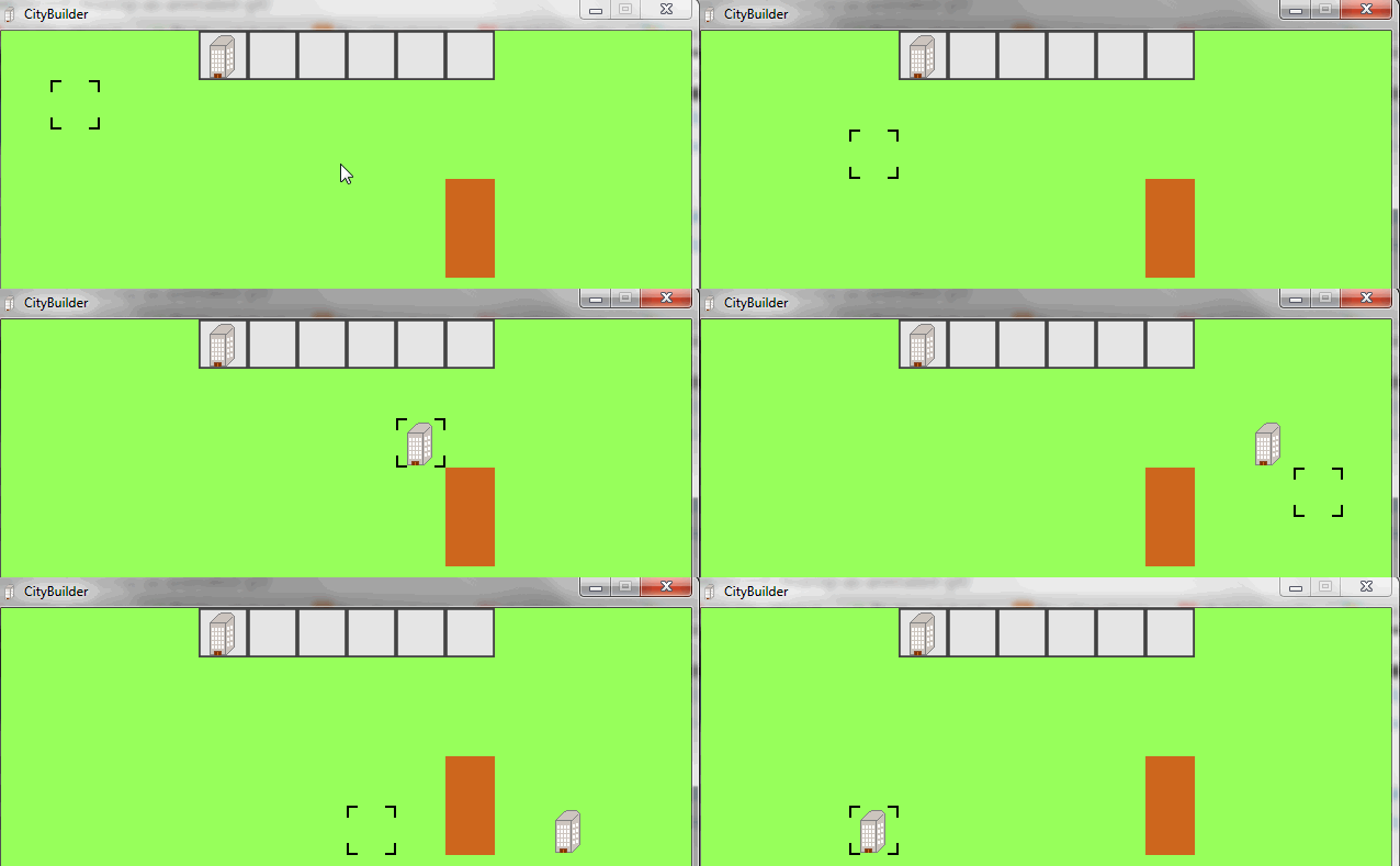
Been working on a SimCity clone. What do you think?

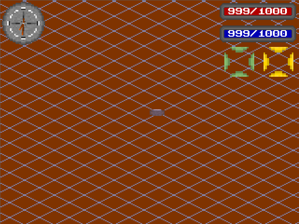
I created the basic UI for my rpg game.
(don’t know how the flashing happened, but i’m not responsible for anything here)

Looks too stable to be a SimCity clone :wink:

I was just coding away on my Raytracer… (Realtime at 60 FPS)


http://abload.de/thumb/raytracerx7sen.png

Right now I am drawing a Bitmap-Font, which I might upload later on.

What do you mean, ‘too stable?’

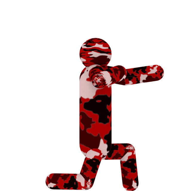
Had a bash at modelling a ‘soldier’:

Anyone here who’s good with Blender fancy helping a brother out? :slight_smile:

More logo playing around:

http://sixtygig.com/junk/splash.png

You’re obsessed with your logo, aren’t you? :stuck_out_tongue:

I like it, but I feel like it could use just a bit more coherence between the “SixtyGig” and “Games,” even if you’re trying to establish “Games” as a subdivision or whatever, I think it still feels a bit off somehow.

I think it’s the segments and dual-tone vs. monochrome-smooth. Maybe it’ll fit with Retro-Castles. Maybe it’s just me.

Yeah, I’m not completely happy with it still. I have just been working on it in between more important things. Probably why it comes up so often randomly because I’ve never given in a full day’s work, just 20 minutes here and there.

I think I’m going to shrink the font down on “games” and maybe give it the segmenty look the “SixtyGig” part has…