Pixel Art - I need guidance!

Hello everyone, I’ve been working on a little adventure game and I’ve created these assets.
I think they look good for what little artistic capabilities I have. I’m trying to get better at pixel art so I don’t need to rely on other people to do my art for me. Are these decent, what could I do to make them better? Suggestions, comments, critic, all is welcome.

This is an unfinished walk animation. I know the torso region looks awkward with no movement.

A tree asset for a game.

A idle pose for the hero.

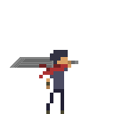
Those look really really good. Most people can’t get the shape down of things, but you’ve somehow got the hang of it :wink: The hero’s sword seems a bit… Floppy. Try to straighten it out, make it look more like a sword.
Also, get some better highlights on that tree, http://kitted.deviantart.com/art/Pixel-Shading-Tutorial-47269811

EDIT: Also, try to motion the chest-up of the torso one pixel down whenever he’s in mid-stride, it’ll really add to the feel of a person walking.

It’s supposed to resemble a “buster” sword like that of Clouds and Aurons from the FF games, I’ve always thought they looked cool. The others in the party have shorter, less ‘floppy’, swords that look like traditional short swords.

I think you might need to look at some buster sword references, as his blade doesn’t look floppy like that.

Better? I literally just moved the pixels up, and I added an extra row to make it thicker.

What are you using to paint with?

Aseprite, the sprite is only 32x32 but I scaled it up in the editor because it was too small to see and I forgot how to scale on the forums.

alternate

not scaled: link to image