FontPacker - Pack TrueType fonts into your game

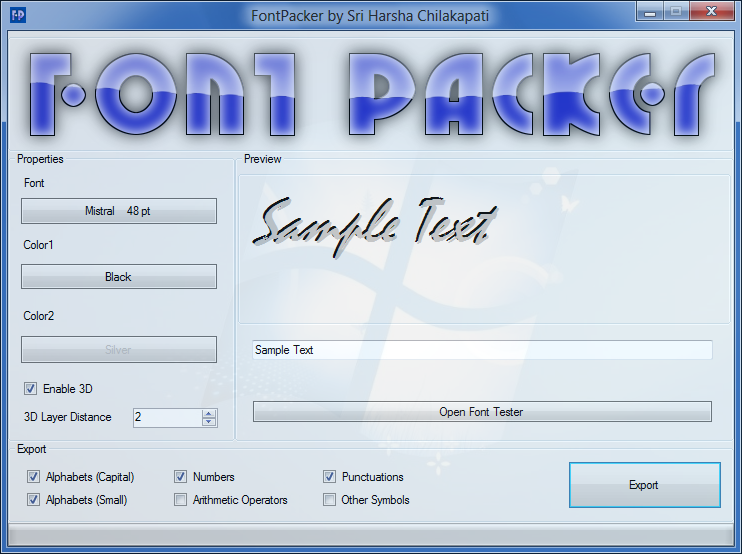
This is my first productive application in C#. It allows to export specific truetype font into a folder with different colors and sizes as bitmaps. Exports the selected glyphs in PNG format so that they can be used in OpenGL games. Here’s the screen shot.

GitHub

SriHarshaChilakapati/FontPacker

WebSite (Downloads)

Transfer2pc.weebly.com/FontPacker.html

[h2]Using the Fonts[/h2]
After you create a [icode].fntpack[/icode] file, you need to use it as XML. Here’s the structure of the file.

The xml file starts normally with the xml declaration. Then comes the root tag [icode][/icode] which contains the [icode][/icode] tag with an attribute [icode]name[/icode].


<Font name="Microsoft Sans Serif"> ... </Font>

Then comes the [icode]Glyph[/icode] tags in the font tag with the following attributes.

  • [icode]char [/icode] - The character value
  • [icode]data [/icode] - The Base64 encoded PNG image of that glyph
  • [icode]xadvance [/icode] - The pixels to move forward after drawing that glyph

Here’s an example overview.


<?xml version="1.0" encoding="utf-8"?>
<FontPacker>
    <Font name="Microsoft Sans Serif">
        <Glyph char="A"
               data="....Base64 encoded PNG image here..."
               xadvance="33" />
        <Glyph char="B"
               data="....Base64 encoded PNG image here..."
               xadvance="30" />
    </Font>
</FontPacker>

The XML files have no indentation which is included in this sample. When using in C#, you can use the pre-made FontPack library available in the git and in binaries.

[h2]Changes[/h2]

  • Added progress bar and font tester
  • Fixed the packer to give correct values for xadvance
  • Fixed the glyph width measuring algorithm
  • Supports Italic Fonts and Script fonts

Sounds neat – I am working on a similar tool at the moment.

What does it export to? Any common formats like AngelCodeFont? Does it pack the bitmaps into a texture atlas?

It looks interesting and I will test it under Mono in Linux when you post it unless it is not open source. D;

The fact that this is written in C# is really tempting me to put some of my non-Java programs in this forum…

@Sammidysam

Yes I’m going to make this open source. I’ll git it when I had my first productive version without any glitches, probably this afternoon.

@davades

I’ll use XML to describe the font the same contains the glyphs. Here’s a sample XML file.


<FontPacker>
    <Font name="Monotype Corsiva">
        <Glyph char="a" data="...base64 encoded image data here..."/>
        ....
    </Font>
</FontPacker>

Now, this can export into XML and also can load them.

Now added the binaries. These are compatible with Mono 2 and more.

Had to write the loader for LWJGL.

Does it output kerning information too?

Cas :slight_smile:

@princec Can you clarify what is kerning?

The separation between letters. For text to look balanced, you don’t want the same advance between every pair of letters.

:emo:

Back to the drawing board!

Cas :slight_smile:

I’m measuring the width of each character by using [icode]Graphics.MeasureString()[/icode] and trimming the image so that they have only the visible character and no empty space between characters. You can see that in the screen shot.

Kerning tells you how closely you’re meant to place those images next to each other, it’s how you get nicely rendered fonts. It’s not about the width of the characters as much as its about the gap you’re meant to place between any given pair of characters.

Cheers,

Kev

Look at your first screenshot: Sample Text. Use the font you exported there to draw Sample Text, and I bet that you will introduce a massive gap between the l and e of Sample, and between the T and e of Text.

@pjt33

Thanks for mentioning. This test proved it.

I don’t know why the letters are moved up.

Can you point me a tutorial on how to use kerning?

Is the Window supposed to be slightly transparent? I find it kind of distracting.

The .exe file runs perfectly on Mono on Fedora 19 64-bit. :slight_smile:

@pjt33

Managed to fix the bug in which the letters go up sometimes. Here’s the new screenshot.

@Sammidysam

Glad that it’s working on mono. Thanks for testing. That transparency is due to me setting the form’s opacity to 95%.

[quote=“SHC,post:14,topic:43151”]
I don’t know any. You could start by looking at the Wikipedia page (and maybe browsing some of the other pages in the Typography category).

If you measure individual characters and then pairs of characters you should be able to build up a table of advances which would work for a first approximation. Of course, then you get into issues with sub-pixel placements, and you might be worried by ClearType patents…

How are you parsing TTF information? Most frameworks offer some sort of kerning data along with the glyph size.

Some other notes:

  • For LWJGL applications, it’s usually desirable to have a single image (PNG or other format) that holds all glyphs. This way we can take advantage of texture atlases which improves sprite batching. Right now it seems like each glyph holds RGBA data, which seems useful for a CPU-based renderer, but would involve a bit more work for a GPU-based renderer (i.e. packing into a texture). You can look into Black Pawn packing algorithm for a fast and easy to implement texture packer. Or you can look into a tool like TexturePacker2.

  • What’s up with the transparency? It looks a bit choppy around the edges and doesn’t seem to blend well with the background.

:slight_smile:

@davades

I’m not parsing the ttf files manually. I’m using the [icode]FontFamily[/icode] class in the .Net Framework to load the fonts. I’m saving each character in PNG format and writing it’s [icode]Base64[/icode] encoded string into the XML file.

For the choppy images, I haven’t yet turned on Anti-Aliasing and so the effect. I’ll enable it once when I learnt about kerning.

That problem exists only with fonts with Italic style. Here’s the screenshot with normal font. Added Anti-Aliasing and it’s even looking smoother now.