Looks pretty cool!
Thank you! I try to make it presentable.
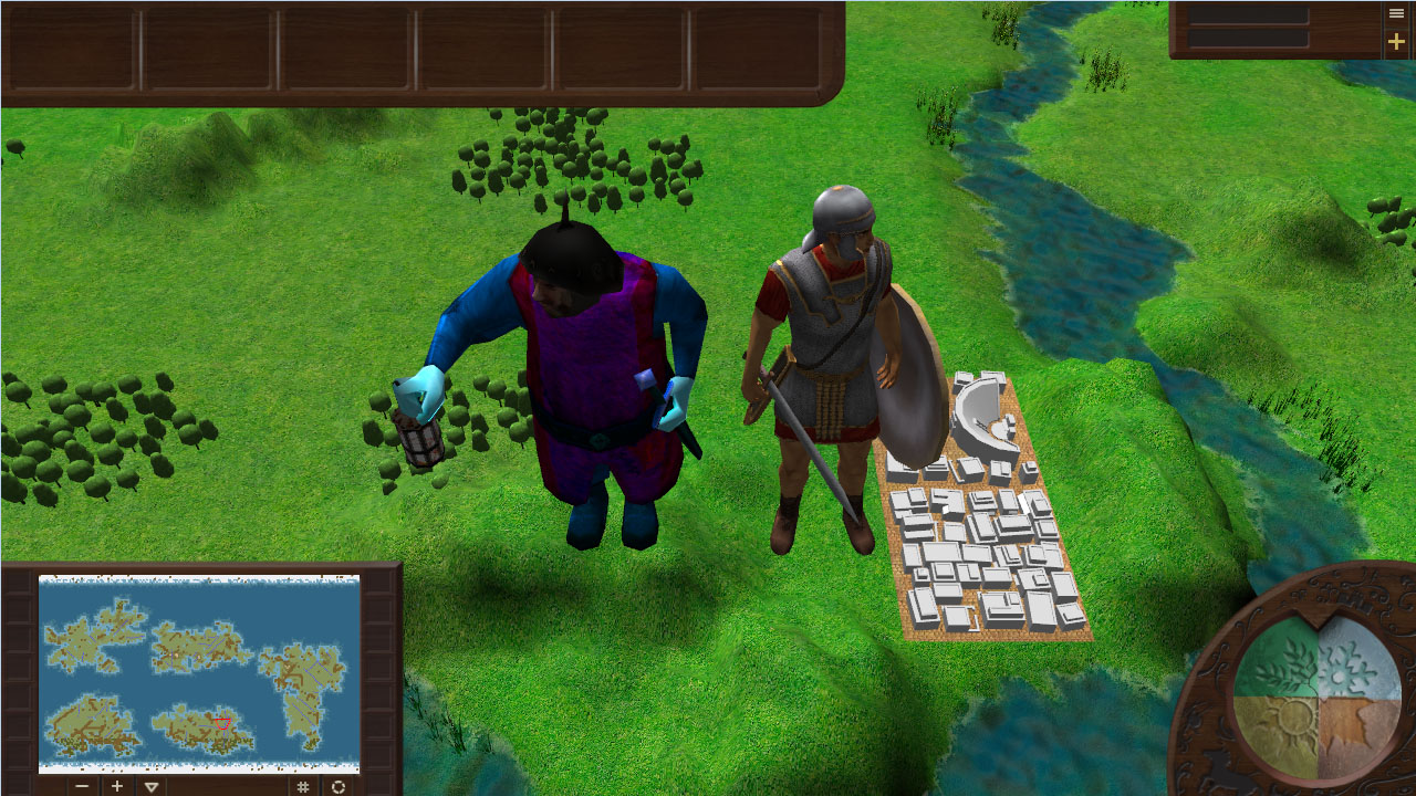
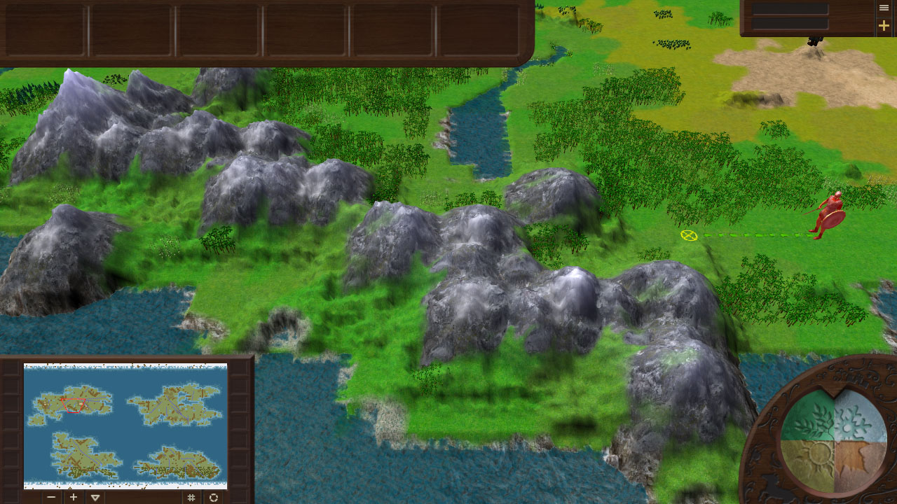
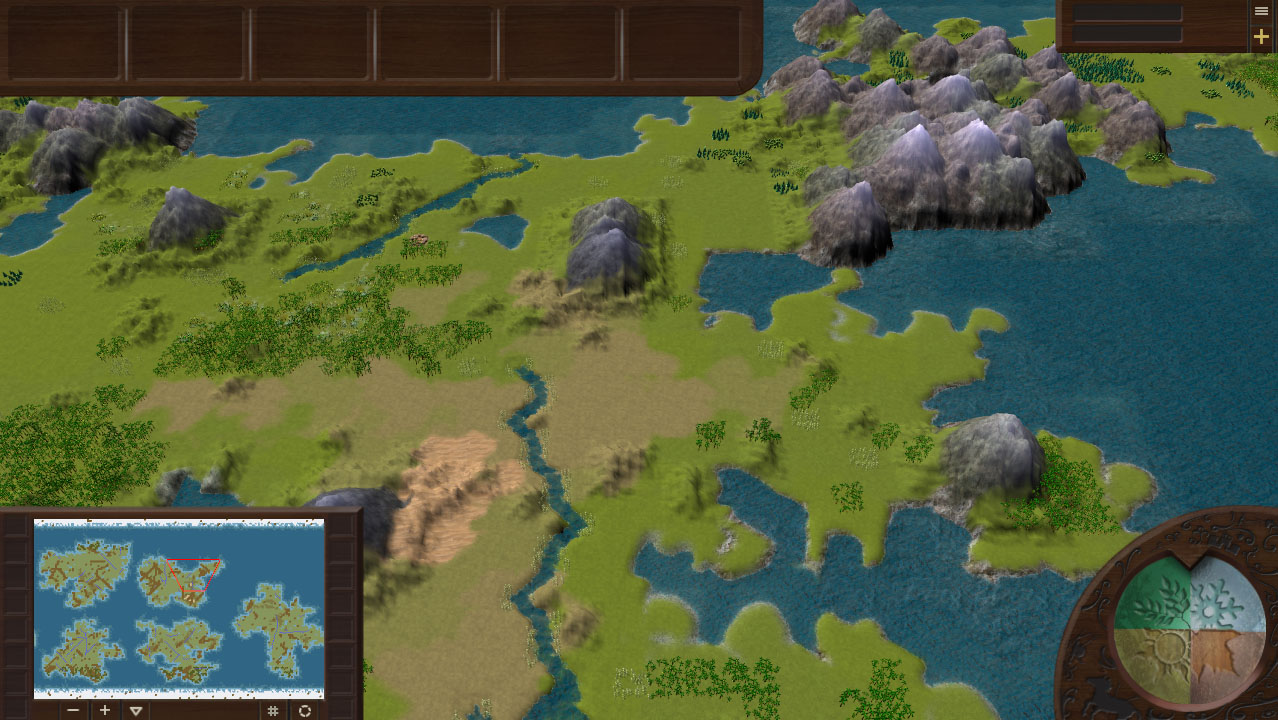
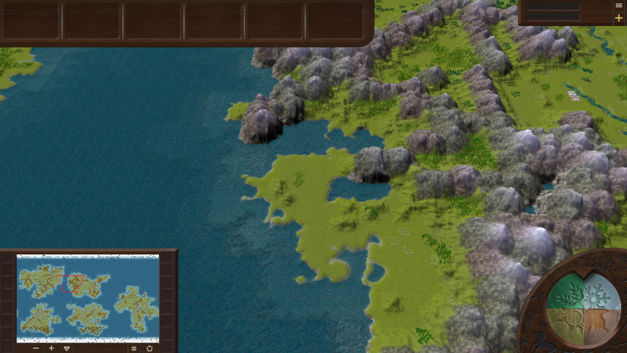
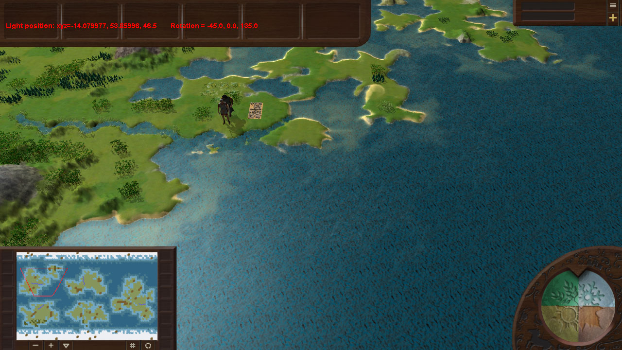
Beautiful! Looks a lot like Civ 4 right now (I happen to like that a lot)
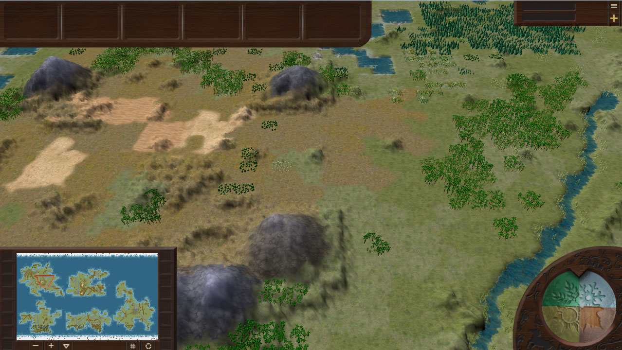
The colors look good overall, the greenest green is a bit too saturated imo, i can’t stand looking at it for too long.
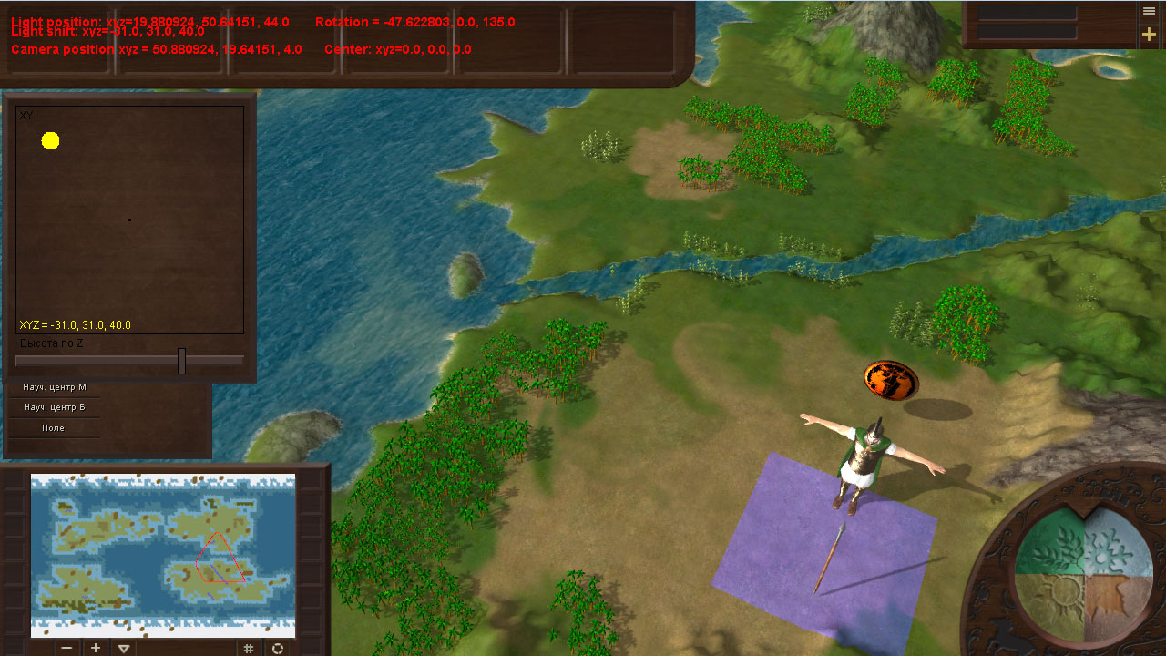
You definitely need some large/medium scale color variation or detail-textures for you terrain coloring. You already have small scale noise in there and it makes it look better but the surfaces still appear flat.
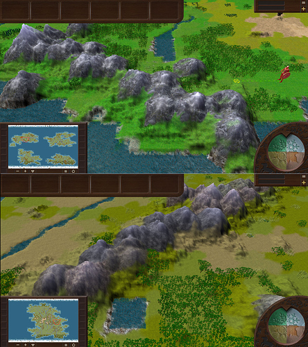
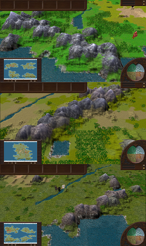
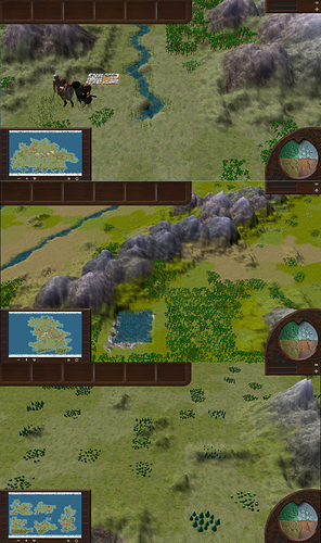
This terrain is a good example:
Notice all the small streaks and islands of color-variation in the grass surface in the upper half of the image?
Thanks for the comments. Do the textures look flat. But I can not make such textures as not an expert in this. If you help me with this I will be very grateful.
You don’t have to make them, just grab some textures from INSERT TEXTURE SITE HERE and mix them with your current texture in your shader.
For example: https://www.textures.com/browse/grass/238
I used this site a lot before, they also have tiled textures.
:point: Yeah that’s already a lot better
Last screenshot?
ye
DE40__Abezc
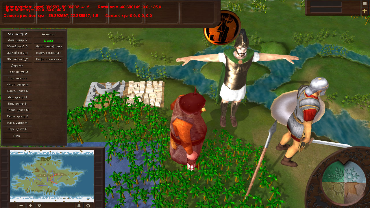
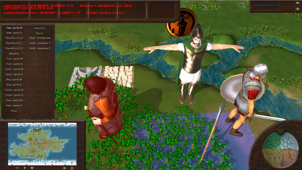
New water and glare on objects with different material!
Now my engine supports NormalMap and SpecularMap.
Added:
Hello dears!
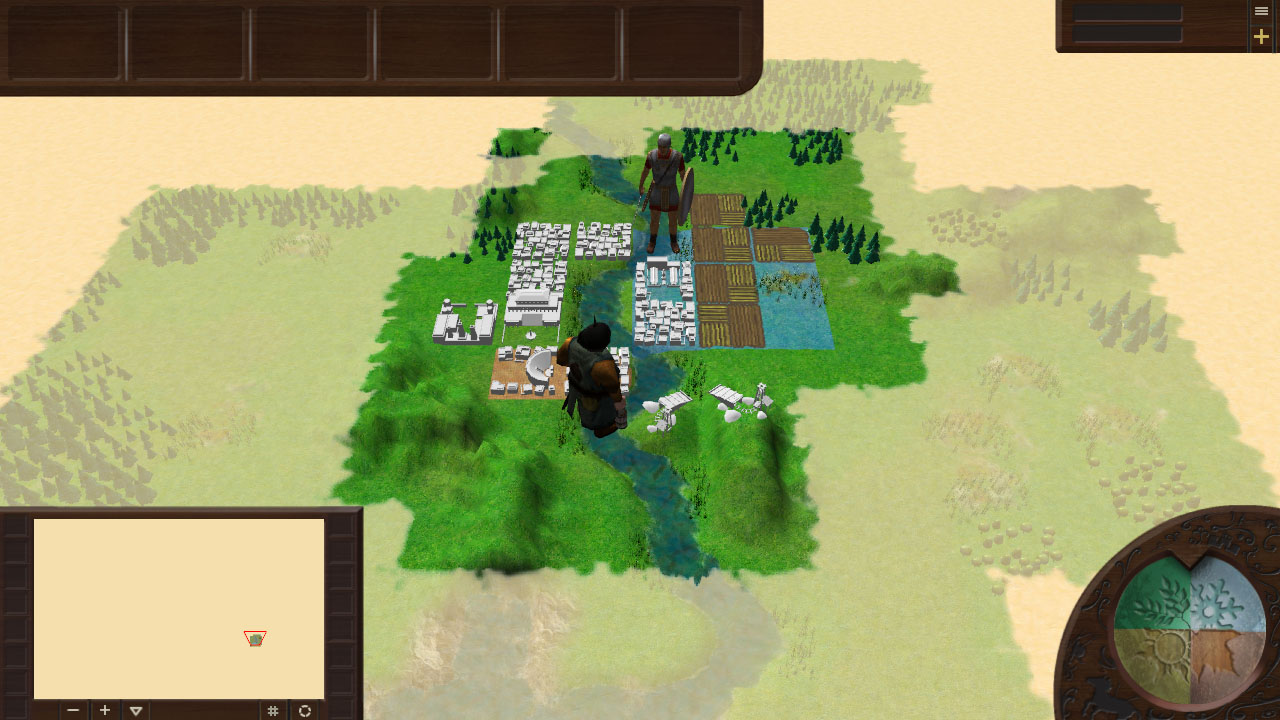
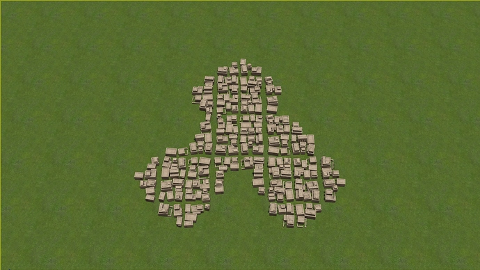
In this short extraordinary diary we decided to tell you about the new system of city expansion, which was added to the game. As you may remember, the original structure of urban areas had a pronounced square structure:
To begin with, this was quite enough, but since this graphic element was quite conspicuous and caused natural questions from some users, it was decided to give it a more meaningful form, especially since it was already in our immediate plans.
To do this, it was necessary to develop a set of urban areas and their parts, which would give the growing city a visually more natural and pleasant look, as well as the logic of their interrelations.
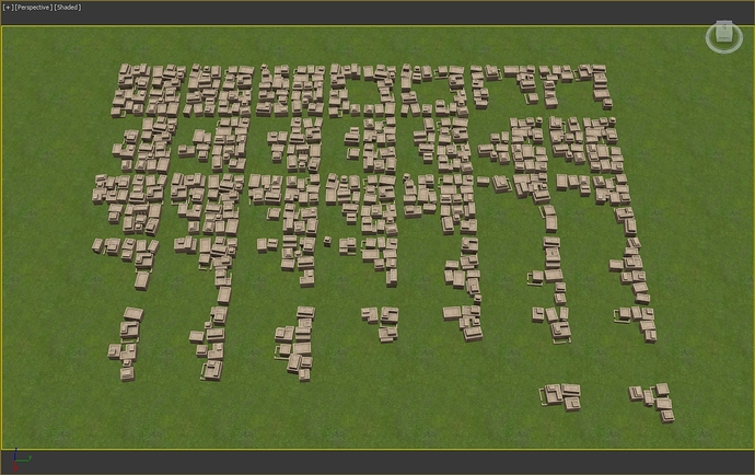
The end result is a set of models that, in theory, should take into account all possible expansion options for flat terrain:
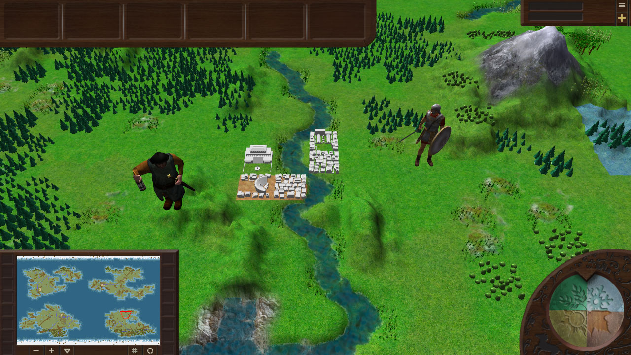
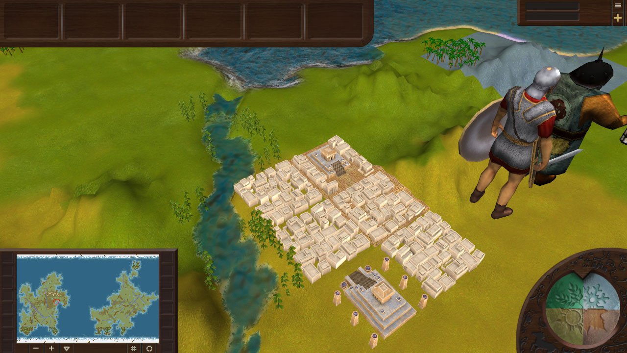
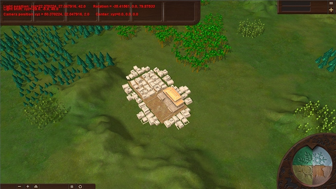
Now the starting version of the city looks like this:
As you can see, due to additional extensions of residential areas, which are not actually them and serve only for decoration, the city got a more natural and visually pleasing silhouette.
For those who are interested in the logic of the use of district models in the expansion of cities, under the spoiler will be attached a number of technical screenshots with explanations:
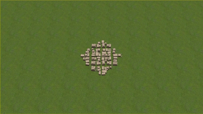
The initial version of the residential area:
To smooth its square appearance, additional elements are added to it. These elements, as noted above, are not independent areas, but serve only as a graphic design:
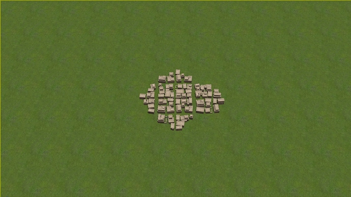
The city can expand in any direction. For example, suppose the following urban area appears to the right of an existing one. The current right extension will disappear, and the following type of area will appear in its place:
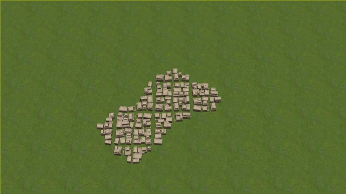
If the area appears at the bottom left diagonally, it will have a square shape, and its additional extensions the following form:
If the area is built on top of the original, the city takes the following form:
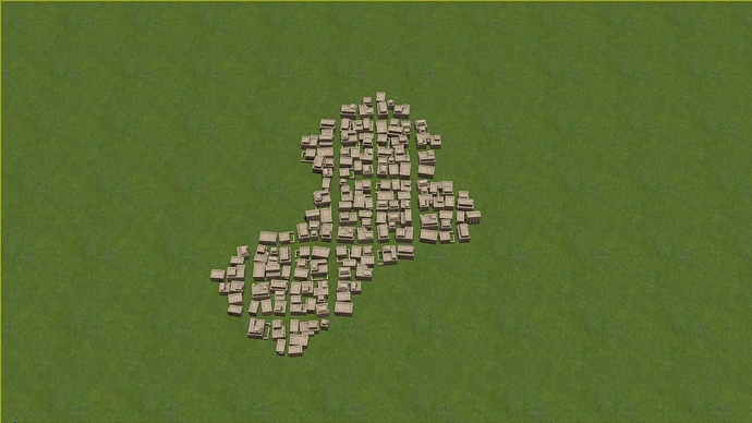
Built a lower right diagonal from the starting. The second built area is replaced by another modification, and an additional area from the bottom to the U-shaped:
Although all possible options for development are not clearly presented here, following this logic, theoretically, allows you to build cities of any possible form.
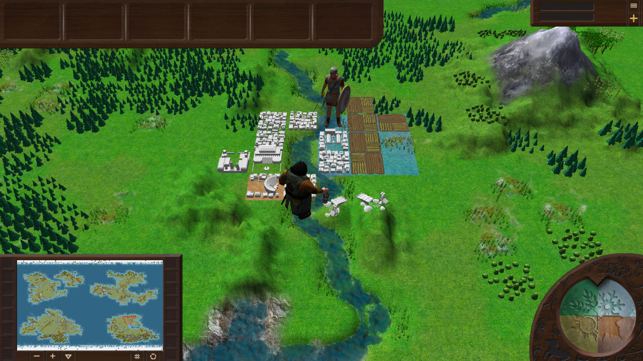
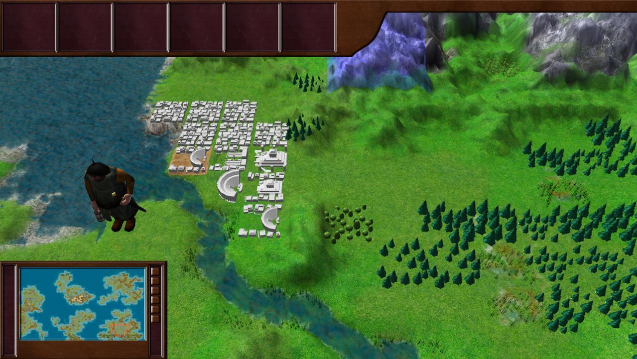
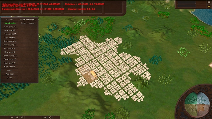
Summarizing, you can see a screenshot of a large city, built in the game in this way:
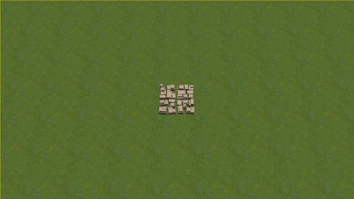
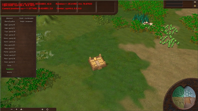
As an added bonus, a screenshot of the Outpost:
Thank you all for your attention and see you soon!

