Sun still clueless with UI design

A while back I complained at the crappy UI design in the webstart installer. And since I’ve got a shiny new pc I thought I’d go through installing the VM as a normal user would (ie. via java.com). Java.com gets the thumbs up, but the installer looks hideous:

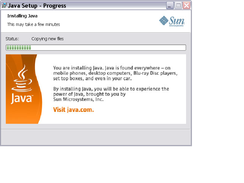
The whole installer is filled with these horribly resampled, overly compressed images which just look poor and unprofessional. Who in their right mind produces an installer which looks this bad and then sends it out for public consumption? :o Someone at Sun needs to get a clue, badly.

Weird. Last time I checked it was a pretty picture.

yup same here, was pretty nice and smooth last time i tried, actually was rather impressed, could be some sort of bug you’re running into.

No cancel button ::slight_smile:

I did not have the graphical problems that the OP had, however the font for the licence agreement text was not aerial or some other standard font but was a “comicy” fancy font which was quite entertaining :slight_smile: I think that this “feature” is somehow unique to my computer.

I think this is more of a QA issue than a design issue. It looks like the install banner graphic doesn’t work well on XP systems that use non-standard font sizes (your fonts look a bit big, which possibly resizes the dialog a bit, which distorts the image). I agree, file a bug - Sun depends on “the masses” to do a lot of QA.

  1. I shouldn’t have to do their QA for them.

  2. Sun have repeatedly demonstrated they don’t give a crap about desktop Java, and reporting it would just be a waste of time.

Meanwhile, I’ll just vent here.

I can also imagine some people would be surprised when clicking on the enormous “visit java.com”, as it probably doesn´t actually do anything.

Looks like there might be a size screw up when running with Large Fonts? If so, Sun certainly isn’t the only one to get burned that way.