[Slick2d] Retro-Pixel Castles > Now on Steam! <

Too bad that game is practically dead ^

I kickstarted that ages ago, it was getting actively developed then suddenly the devs just stopped posting stuff, might have changed since then.

EDIT : Just tried the website, its down. Seems they took the 3/4 of a million $$$ and ran.

[quote]That means you were awake until 5:30 AM? ::slight_smile:
[/quote]
Whats wrong with that? :clue:

heh, my games really not like Castle Story at all (aside from the castle management aspect I guess? But mines more RTS style in that regard). Although I was unaware it died, real shame. I thought it looked pretty cool too. :frowning:

and I was up till about 3AM last night. I’m a nightowl by nature. I think I posted that on my way to bed. :stuck_out_tongue:

Castle Story is dead? Their website is down? Where are you getting this from? It’s on sale on Steam and their website is up and running…

Took a GUI break and created some parallax scrolling stars. These render behind the map, so anywhere on the map that has a hole in it (or along the edges of the map) you’ll see them.

http://sixtygig.com/junk/parallaxStars1.gif

Love your little details, as I’m sure I’ve mentioned before but thought that I should say it again.

You fall in love with the little details of games…

I’ve been doing a lot of code refactoring the past few days, so aside from the Parallax Stars there hasn’t been much to talk about

… … until now! I’ve polished up the GUI now that the GUI code itself is mostly done, it’s a huge improvement over the old temporary artwork I’ve been using! :slight_smile:

http://sixtygig.com/junk/InDev-2014-06-15-3.png

http://sixtygig.com/junk/InDev-2014-06-15-5.png

Also, here’s an updated gif of the parallax stars when you’re idle, just for fun!
(Note: The GUI in this shot was about halfway through the polishing phase, just disregard it. :wink: )

http://sixtygig.com/junk/parallaxStars2.gif

Look amazing, honestly. Good job with those arty touch ups ;D

Still chugging away on polishing up the GUI and doing tweaks to the map editor. I also allowed some people to try out the current version, took their feedback and made a ton of minor changes and tweaks to the interface.

At the rate I’m going, hopefully I’ll be able to get a public tech demo of the map editor out sometime this month. I still have some critical things I have to add, like the ability to place/remove objects. But, most of what is leftover is just tedious coding.

I’ve also got http://retropixelcastles.com up and running! But for now, it’s just a simple splash page. Let me know if the URL works for you. :slight_smile:

Here’s a few new shots as of today!

The background in the main menu is now set to your local time of day! When you launch the game at night, it’ll be nighttime in the main menu! :slight_smile:

The map loading screen. (Incomplete)
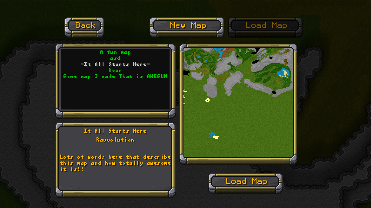
Just the most recent shot of the GUI, as of today.

That URL isn’t working and either are those new pictures :’(

EDIT:

It is all working for me.

Both work for me, so it’s not on Ray’s end.

Yeah, the domain was just setup a few days ago, might be a few stragglers who can’t quite access it yet. :wink:

>>Download the Map Editor TECH DEMO HERE<<
http://retropixelcastles.com/junk/rawbuilds/RPC-InDev-6-21-2014c.zip
(Disclaimer: Don’t forget to provide constructive feedback!)

Explore all the old builds, if you dare!
http://retropixelcastles.com/junk/rawbuilds/

Please remember to provide some feedback! I am doing these releases so I can get feedback on the user interface, and how the overall experience went for you. Feel free to share your screenshots, full map images and maps files too! I want to see what you guys can do with my editor! :slight_smile:

Shortcuts/controls:
Mouse based map/minimap movement - Hold right-click and drag
Keyboard based map/minimap movement - WASD

Screenshots - F2 (Will place in the screenShot folder)
Debug mode - F3 (If you really want to see it.)
Eraser - E
Grid Mode - G
Patch Mode - P
Hole Mode - H
Select Mode - Q (Currently disabled)
Toggle minimap - Tab
Toggle Accent Mode - Hold L. Control

Immediate thought: create more contrast (brighter color, border, whatever) between the mouseover text in the main menu when hovering over an activated button. Looks fine on a deactivated button, but it’s a bit difficult to make out over a lit button sometimes.

EDIT: I realize that text isn’t important, but having it pop up like that will draw attention invariably anyway, so I wouldn’t then make people strain to read it to discover it’s just some fun little text. User shouldn’t have conscious realizations like that I think. Would just look more pro overall too. Just a suggestion :slight_smile:

That’s a common complaint I’ve gotten from a few of the people who got to play around with the editor before I publicly released it, another also being that they don’t like the floaty font at all and want me to place it somewhere static.

I’m thinking about adding a small “info box” on the bottom of the screen that shows highlight info, because even though it’s nice to see things right above the mouse, it seems to be disruptive. My only concern is the static info box not being right where your eyes are looking may make it a bit harder for newbies to the editor/game to figure out what everything is, I just feel having to “look down” to read the box may be cumbersome after a while. Guess we’ll see. :smiley:

I do like both floating texts, just that the hover variety disrupts the experience just a tad.

I can’t seem to get a screenshot of it to tweak, but a darker, slightly more opaque color would work against the white text background I think.

In highschool when people would make presentations or whatever, sometimes they’d put straight black text over a picture background or something, and it was impossible to read most of it due to the lack of contrast. Ever since such things always immediately irk me.

F2 should drop a screenshot in the /screenShot folder, is it not working? Although I do see what you mean, I’ll play with the opacity and shadows and see if I can make something more bold.

Hah, I still see that all the time in college, even from people who have 4-year degrees already. Off gray text on a slightly darker gray background, red on blue, green on a photo of of a forest. Ugh. You’d think they would learn by now! :wink:

You must fix texture bleeding!

uhm…

…what texture bleeding? :o