I actually Like the older HUD better… But I like that there is more information on the new HUD. That’s whats missing on the old HUD.
I think using less gradients and using more of some kind of (more or less) random patterns on the UI makes it look nicer, it’s hard to describe, though
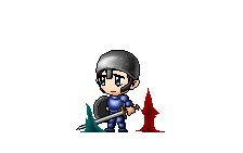
I also really like the skill effect, it looks really cool!
I think it looks better now (Longer EXP bar and can fit a longer name )
Thanks for the feedback!
Haha, yeah, the older HUD was way too small for me to be adding enough information to it, part of the reason we switched
The new UI is designed to look more modern, more generic etc. As this is more of a fantasy MMO it didn’t really make much sense to be theming everything with wood lol.
I also added translucency to the windows so you can kinda see what’s behind them (they become more translucent when dragged around)
And thanks I’ll post a video of the new skills later, they look so much better animated, trust me
For example operating systems have gone to enabling translucency in their windowing systems, etc. I just think that having translucency in the windowing system and making it color-skinnable makes it look more modern
I think the retro look may be attributed to the fact that I decided to theme it purple, but you can actually theme it any color you want, I just like the purple look
For my taste, you shoud move the hp/mp/xp text more down and remove / move the Super GM text or give it some more margin at the bottom.
Also the bar gradients have a little to much contrast.
Doing so, revoves the cluttered effect some more.
But seeing how much nice stuff you made already, i cant really say stuff about your game. :-X