Need IDE with native font rendering

Well, I have wanted to take my development mobile, and onto my laptop. The problem is that Netbeans, my IDE of choice, renders fonts horribly ugly compared to other applications on my laptop. Here’s a screenshot to show the comparison between netbeans and wordpad of the same font and the same size and color. The top one is netbeans and the bottom one is wordpad:
http://img29.imageshack.us/img29/9349/compare.png

Now, I really need a solution to this, as I CANNOT develop with that font as I am prone to migraines, and it hurts my head a lot after a few hours. Any suggestions of an IDE that doesn’t have this issue or a fix for netbeans 6.7 would be greatly appreciated.

Netbeans uses anti-aliasing text, so I guess turning it off would solve your issue. Not sure how or if that’s possible…

Google suggests adding “-J-Dswing.aatext=false” to the netbeans.conf file. Odd though, as it looks like it’s trying to do subpixel rendering, when really it should pick up the system wide setting for that (and therefore be “off” since it’s not shown in wordpad).

I found a bug listing for exactly my problem with the font rendering here: http://www.netbeans.org/issues/show_bug.cgi?id=158778 I guess I just have to wait for it to be resolved. Supposedly it has to do with using more up to date versions of the JDK. Sadly the update has been around since February, and hasn’t gotten any attention, so I don’t know if they ever plan on fixing it, which is a shame, since it’s a good IDE otherwise.

Go with Orangy Tang and disable antialiasing

I tried that command as well as another one I found on google, but it doesn’t appear to do anything.

EDIT: If I turn off font smoothing in Vista all together, it appears to fix it, but then the rest of the OS looks really ugly compared to with ClearType on. For some reason, it seems like Netbeans notices I have font smoothing enabled in the OS and then applies its own ugly version of font smoothing, but it won’t if I don’t have it enabled in the OS. Is it possible to enable font smoothing only for certain programs in Vista?

EDIT2: Adding " -J-Dawt.useSystemAAFontSettings=false " to the default options in the netbeans.conf file fixed the issue. I still would like native font smoothing, but now it’s completely bearable.

What you see is native font smoothing. Java (starting with 6u10) uses native GDI font rasterizer on Windows for font rendering.

Dmitri

Yeah, based on the info you’ve provided, it’s Word Pad that has the bug. Netbeans is working fine. :wink:

ClearType is garbage IMO. Turn it off, then on and note that it completely ruins many of the glyphs and sometimes the kerning too. That is with my monitor in landscape, I usually use my 24" widescreen LCD in portrait so I get ~2 pages of code. With the LCD rotated, I don’t think the subpixel stuff works right, even going through the setup for it.

My solution is to use a bitmap font. You can’t change the size, but you can generate a bitmap from from a TTF using Softy:
http://users.breathe.com/l-emmett/
I like Softy a lot. I went to pay for it but its author has apparently passed away. RIP.

I used Softy to rasterize BitStream Vera Mono and I used it exclusively for all my programming. Each time one of the glyphs annoyed me, I used Softy to edit the glyph’s pixels. I named the resulting font Lava Mono 9 and I have been using it for years. You can get it here:
http://n4te.com/tools/LavaMono9.fon
It looks like this:

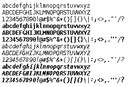
I think it looks surprisingly like a variable width font, even though it is fixed:

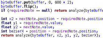
When I use the Lava Mono font with my text editor, SciTE, there is very little space between lines. It has been so long, I don’t remember if I used Softy for this, but I definitely get more lines per page with my setup than other fonts. With my 24" monitor running 1200x1920 and the window maximized, I get 126 lines of code visible in SciTE and 123 in Eclipse. With Courier New at the same size (8) I get 107 lines in Eclipse (don’t know about SciTE).

I would bet that ClearType can’t handle a rotated LCD. I prefer ClearType to be on… some people claim it makes things “blurry”, I think it makes things easier to read than with the jaggies… but as mentioned font selection can make a big difference too.

True, it doesn’t work rotated. But I dislike it unrotated too. It changes the shape of glyphs, eg look at the "o"s:

http://n4te.com/temp/clearCrap.gif

pixel order should be configurable in a good os :wink:

There is no good OS, haven’t you seen the “Worst OS ever” thread? :wink: