Looking for feedback on art and level design

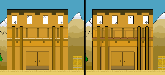
The game allows the player to jump on top of the crates and to jump on top of the bar building plus the platforms on the other two buildings. See the gif for example. The problem I think is conveying to the player that these are actually platforms and not just background art.

How can I make these stand out to tell the player they can walk/jump there?

http://orig05.deviantart.net/4458/f/2016/347/5/0/christmasmap_by_ndnninja15-daribw5.png

Shadows that show the player how far the wooden structure is away from the wall.

Also link specific colors and shades to specific things, along the lines of traps are always glowing, doors are X percent darker than other level geometry, etc. This needs to be consistent (at least within a level) to not confuse the player.

Changes:

  • Drop shadow (only on the wall :wink: not on the support structure)
  • Darkened the platform-floor and raised it’s contrast
  • Extruded the outer edges of the platform floor by one pixel to separate it from the house

The house on the right (in your initial post, not the one in this reply) has more contrast and a better front to back brightness transition, but the railing support is too fat/obstructive.

I’ve never had to deal with such issues so far… looking at the images, I’d start by making the background more clearly the background, things like making the colors somewhat more muted.

Similarly, if you make the boxes / platforms darker colors then they will stick out more.

This might be a more complex solution, but I noticed how the player is almost fully hidden by the stuff over top, but if you could increase the alpha of a circle around the player, only affecting the foreground, then the platforms will stick out further from a distance… but I can’t see that being simple to accomplish.

Another option, if you save the black borders for only walkable terrain, then the terrain, blocks would stick out more relative to the background / foreground.

Vatterger made some good suggestions too, imo.

VaTTeRGeR thank you my man!

Wasn’t thinking about drop shadows and that one pixel out to the side makes a big difference. Thanks for the suggestions!

bmanmcfly, do you mean lower the saturation in the background colors to make it muted? I’ll try out the black borders thing you mentioned and see how it goes, thanks.

Here is a couple of amazing videos on directing the player through level design:
While they may not be applicable to your specific problem, hopefully the concepts will help you be able to think more critically about level design, subsequently helping you overcome both this problem and ones in the future.

k70_jvVOcG0

MMggqenxuZc

@NegativeZero

Not 100% related, but why is there a gun when you could be throwing presents?

Because the goblins stole all the presents. The goal is to get them back.