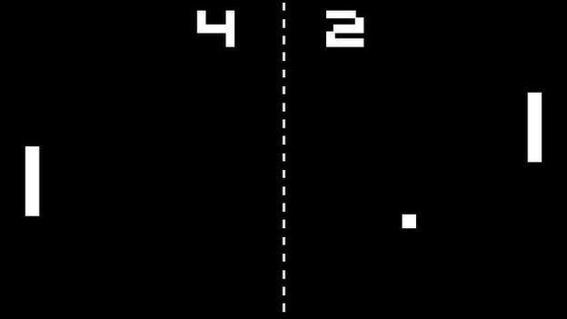
I hate hi-res graphics on voxel based games

There, I said it!

From hi-def textures pack for Minecraft to new games using all the graphical bells and whistles on their voxel-based worlds.

To me it feels like they are ashamed of their natural blockyness, instead of embracing it.

More seriously, the more I see of those projects, the more I realize Minecraft’s retro style was about embracing the limitations of the medium and making the most of it.

We should learn from that… I guess. :stuck_out_tongue:

I must say I agree with you. I don’t find it appealing at all. In fact I find it harder to see anything to due to enhanced detail, and this is directly in opposition to the simplistic nature of these games. It’s also a hit to the player base as I suspect the majority of players of these games aren’t running the highest end of PC’s.

I really like the style of the game Block N Load. While it does have high quality textures with high quality options on, it’s primary effect is from the manipulation of the block shape. It’s not a cube, it’s distorted on each side, and it looks rather good.

That art style reminds me of Ratchet and Clank. I loved those games as a kid.

Yep, they definitely defined games for me. Games like Ratchet and Clank, Jak and Daxter, Tak, and FF, are my historical favourites. I feel like games aren’t made for the sake of games anymore, but rather to display advancing technology and of course to make profits. LittleBigPlanet, and BioShock 2 (Multiplayer) are my more recent favourites. The graphics are nice on those, but only as much as they need to be.

I hate blocky pixel art, with very low resolution stretched up and displayed.

Everyone has their own preferences and art style. I don’t think there is a point in this thread seriously.

I agree totally, the developers of these kinds of games aren’t embracing the limitations of this medium. Trying to make the game be something that it’s not, and then ends up failing at both looking good and looking like it really fits with this kind of game.

We need to embrace a new design philosophy, a simple and effective design…minimalism. In fact…, a minimalist design philosophy would work with nearly every game out there…

For example, let’s look at a well known offender when it comes to effective graphics and design, Bethesda’s TES:V, Skyrim:

http://www.nordicgamesupply.com/includes/uploaded_pictures/1309849339pzwr/originals/1315922240xrdz.jpg

It looks like shit. It’s a complete mess. All those confusing colors, distracting fog effects, annoying depth of field, lighting effects that really hurt my eyes, etc… I can barely make out what I am looking at…

One modder took it upon himself to fix Bethesda’s shit work however:
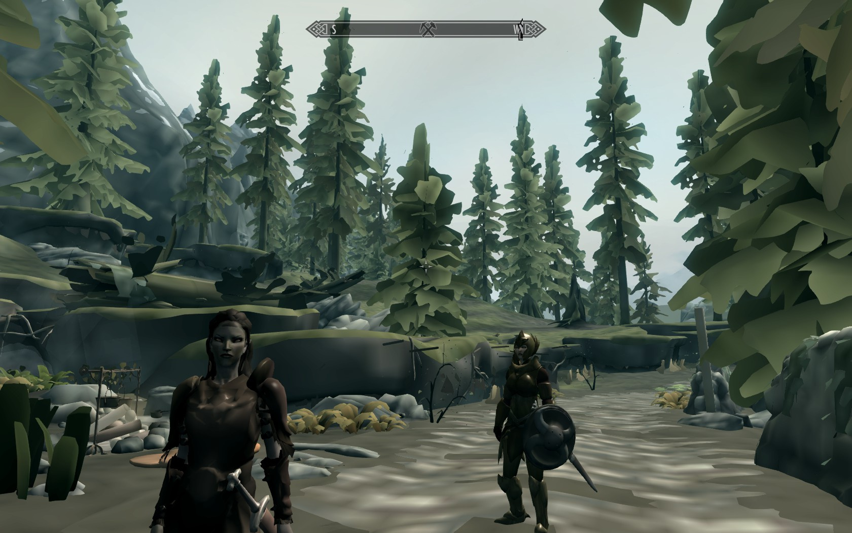
Look at how much better that is! Look at how everything is quickly discernible in quick glace! Now there’s still some problems with it, but at least it’s actually playable now.

We need to reduce colors, we need to get rid of useless “atmospheric” effects, we need to get rid of Depth of Field, random lighting post-processing effects need to be gone, and everything should be simple and effective at painting a scene.

Just enough visual information to just play the game, not distract you with pointless visual effects. I honestly commend games like minecraft for not taking the route of most games, and remaining somewhat simple.

And not look like shit.

Hmm… I think there you are wrong.
This might just mention texture resolutions in voxel games explicitly, but it transfers to a lot of other phenomena, as mentioned by Husk (EDIT: and waratte), where games become all about how detailed they look.

This conversation, however, has been had before though IIRC…

To be honest, I think that Skyrim graphics style fit this game perfectly - on second screenshot I am barely able to recognize anything, although situation would be different if the whole game was designed with this style in mind.

On the other hand, there are games where hi-res graphics (and “hiding”/smoothing voxels) are usually more harm than good:

Let’s take a look at Space Engineers/Seven Days to Die - both of them have “mixed” style with semi-realistic terrain and square structures. Due to that, terrain to structures transitions look terrible, there are problems with determining actual terrain “volume” as well.

Terraria/Starbound - while being 2d games, so hard to compare to the ones I mentioned above - solved this problem perfectly. Terrain is not perfectly squared, but transitions are clearly visible and therefore editing terrain is much easier and more enjoyable.

I hate this thread.

Seriously, Riven wanders away for a few days and it’s like Lord of the Flies.

Cas :slight_smile:

Where did Riven go?

Dear diarrhea,

I wandered into Belgium. No way to get home, everywhere I turn, I hear voices - it’s French. Wifi is stable, exposed my hotspot to a girl from Lima.

Luv & protection, OUT.

This is a Pixel. Isn’t it beautiful? Modern games have way to many ordinary pixels. Now back in the days we had some really good Pixels:

Now look at that. So much awesomeness in so few Pixels. These days I feel like pixels are undervalued. They are just thrown around on the screen like nothing.

Heh, I was being sarcastic in order to spark discussion. I don’t think an specific art style is inherently superior/inferior to others, it does come down to taste, but I do find interesting how often games with specific limitations are loaded with all kinds of bells and whistles, which end up clashing horribly.

Actually, if you look around, nobody makes original games anymore. I’ve talked about this a lot in other places. I share similar favorite games, but not the last 2.

I’ve always liked lower res games. The motion blurs need to be taken out of games, agreed, but not when you need to disorient the player. I don’t like super high res textures. Although, this is seen in TES: Oblivion. The one problem with that game is it’s lifeless. There is little sense of community, but it was all blocky and wasn’t very roomy. There was no life.

The problem is consistency, not the quality. And it’s a very difficult task to achieve consistency with high quality, high resolution graphics without a hell lot of effort. You can see the problem outlined on a topic of quality vs esthetics. Also high quality graphics give a very rigid feel due to the fact that it’s to the player interpretation of pixel and the hi-res graphics are by most of the time explicit in their meaning.

That said I would say that even Minecraft is abomination of esthetics at places - you get low res textures over hi-res rasterized blocks. That is ridiculous. Fortunately the color theme is very coherent, and that is (pluss the pure game logic) I guess is what attracted so many people to the game.