

2 Likes
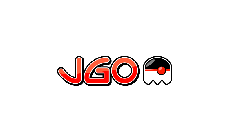
red or blue
I like red better, makes sense since we now changed the domain to jvm-gaming instead of java-gaming. What does the maintainers think about this?
Nice work!
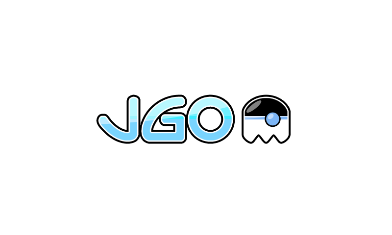
I like the little pac-man like critter. I think it reads well, bringing up both associations to games and the Java mascot.
It seems to me the red pops out nicely, especially with all the blue on the site. But I also like the way the blues harmoniously work with the existing header background color. If the red is chosen, would we also then tinker with the header’s color scheme?
In one aspect, the first graphic is my favorite. I like that it has a sense of motion, like this little critter is moving out from behind the logo. (Am reminded of the way the pacman dashes about.) I think the diagonal on the letters helps with the sense of motion, and am wondering if there are other tricks of the graphics trade that could contribute to sense of the critter-in-motion.
I’m wondering also about simplifying the coloring in the blue letters to that of the red scheme, using just two shades instead of four or five.
Cool though, and an improvement on the existing logo, which I don’t exactly understand–is that the Java mascot sitting on his head, waving to us?
I kinda got the same doubt with the existing logo. It also reminds me of Riven’s profile picture which says ‘hand over the head’ I guess.
I just took the logos that were available on the other site. It’s an easy change. I’ll see if I can change it and we can see what it looks like
I’ve switched the over to the other blue, will trial the red in a couple of days.
1 Like
I really like these, and it looks nice on the dark theme as well. The red one goes with the favacon too.
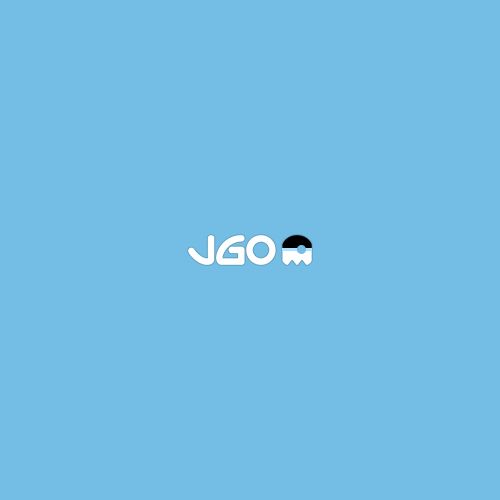
Made a more flat logo that maybe fits better for the header?
transparent:
![]()
header background:
The last one doesn’t work so well with the dark theme because the banner is black, I changed the header only to the new one. If you look in this thead you can see both (on desktop anyway). When you are at the top of the thread you can see the new flat one, when you scroll down you can see the other one from yesterday
1 Like
Logo seems to be 2 different logos and one is not so dark-theme friendly

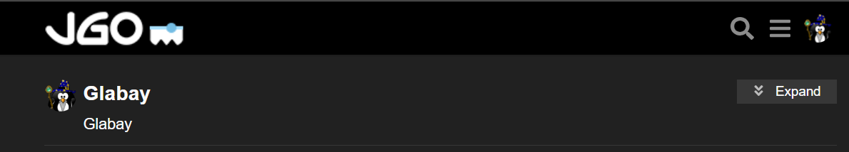
Bottom being in my Profile Settings the top being this post
Edit:
Seems like the bottom logo is the one on most of the site except for legit thread postings like this one

FWIW, the flat versions strike me as good but unexciting: quite acceptable and preferable to the upside-down avatar version from before.
1 Like
We have gone red! So three to choose from. Red, Blue, Flat Blue
1 Like
IMO, Blue for the light theme, Red for the dark theme.
Does the mascot/avatar have a name? It looks like it’s been drinking. Or should be named Rudolf.
Actually, I like the critter in red better than I thought I would. But the red letters, no.
I hope you aren’t going to drop the blue diagonal line in the letters. I’m imagining that this critter could work with the blue letters.
I liked the red one with the gradient in letters a bit better, flat one kinda looks a little out of place on 5K screen. I still like this one though.
Well the JGO mascot is a hybrid between the Duke (as representing Java) and also the pacman ghost (representing gaming). Hopefully that is obvious 
It’s a pretty old design, and I didn’t create it in a SVG or similar back then. But I think the icon is fairly simple in design for anyone with basic Inkscape skills to create a better icon. I have other interest at the moment so not much time for this.
The font is something I found in a 20+ years old font collection that is no longer supported or available. I don’t have that font anymore I think.
2 Likes