Game Menu Demo

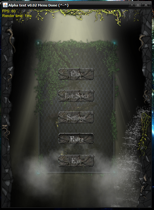
So here is the menu screen I am working on.

http://www.mediafire.com/?f5jaggir0q8nqaf

Not all of the buttons are complete. (because I have yet to finish programing meh UI system)

I just want some input on the general look an feel. To dark, to bright, no ponies, anything. I think it looks good right now but…I want better lighting >:(

I also have “some” sound working in it using .ogg and well I think I need to switch to lwjgl because trying to get .ogg files to play properly in java is freaking hard… (for me at least)

Anyways have a look.

Edit:
Did some update a while ago Idk if I will continue much on this at all…any ways, the menu system is basically done even though to is probably not very efficient I think it was good practice.

Screen shot

You better put screenshot. Not many of us want to DL it first, especially in work time. :slight_smile:

I think it looks pretty good :slight_smile:

Though I can’t decide if your buttons are too futuristic compared to the rest of it.

That looks good! Buttons are a little bright for the rest.

So it’s purely java2d? great!

@regenuluz

Yes I think the buttons are too techy looking so I am redoing them.

I will also use text rendering instead of having text build into the buttons. Wont look as good but less memory. :smiley:

Here are the three I have made so far. I can’t decide which I like best so advice would be great.

Button 1 “Blank no extras” :cranky:

http://s12.postimage.org/bz4sr4cih/but2.png

Button 2 “Dark green moss” :slight_smile:

Button 3 “Vines growing from it” ;D

Tell me what you think?

Wow, it looks amazing! I love the waterfall and the “smoke” coming off the buttons. Is this all made with standard animation tactics, or is it particle-systems?

Also, cool that you’ve used that old russian melody. I always loved PPK’s rendition of it called “ResuRection” :slight_smile:

What kind of gameloop are you running? I see a tiny bit of frame-skipping due to it running about 58fps constantly. You should really make an effort to get a stable 60fps for smoothness on most screens. There are many great tutorials around this forum, and I believe complete code-examples as well. I know I left one somewhere. I can find it if you’d like.

Again, amazing artwork. Really immersive. I could really use a menu as dynamic as that for my new game. You’ve inspired me

[quote]Is this all made with standard animation tactics, or is it particle-systems?
[/quote]
Nope it is a particle system with emitters, effects, and the such.

[quote]What kind of gameloop are you running? I see a tiny bit of frame-skipping due to it running about 58fps constantly. You should really make an effort to get a stable 60fps for smoothness on most screens. There are many great tutorials around this forum, and I believe complete code-examples as well. I know I left one somewhere. I can find it if you’d like.
[/quote]
I was running a really bad game loop…the first one I ever did was recursive and I got stock overflows all the time…
All of my code was made without interpolation in mind so when I found out about that form of game loop I did not want to rewrite meh code.
The new one I am using gives a steady 60fps not a lot of jittering that I have found.

UPDATE:
I have updated the link to my new menu. I think I got the look and feel down so now its time to make game. The menu should give you an idea to the games theme.

Here is a Screen:

I would really like people to test it and see how performance is, any errors, no sound, etc. (should be super fast not a much going on)
This is because most of my resource loading and rendering/playing is done here so if this all works, everything in the game will.

It looks really awesome :slight_smile: A few things though… :stuck_out_tongue:

You forgot to change the level select buttons xD And the text is a little too bright, so it’s kind of hard to read it. It also looks like the buttons just pop into view while the background of them slowly fades in. (And imo, then they show a little slow… :stuck_out_tongue: But that’s properly just me being impatient and all xD)

Other than that, I think it looks bloody great. :slight_smile:

Awesome… I’d like to have you as artworker :smiley:

Change the font, sir. Morpheus is too overused :confused:

Makes it look amateurish, even when everything else looks good and pro

Thanks for the input all I am taking it all into consideration and by that I mean you will get what you want.

[quote]You forgot to change the level select buttons xD And the text is a little too bright, so it’s kind of hard to read it. It also looks like the buttons just pop into view while the background of them slowly fades in. (And imo, then they show a little slow… Tongue But that’s properly just me being impatient and all xD)
[/quote]
I will let you skip the intro by pressing “Esc” and the buttons text will be more readable. The reason why it is brighter is because darker texts are almost unreadable on darker buttons with out some sort of glow around them and because I am trying to keep game resources small I can’t do glowing text.

[quote]Change the font, sir. Morpheus is too overused :confused:

Makes it look amateurish, even when everything else looks good and pro
[/quote]
I have only seen it used in one game and that was Arcanum. I guess I need to get out more. ;D So to combat the amateurish threat of overused fonts I will make meh own. :smiley: Take that! hehe…I mean how hard can it be? :clue:

It looks fine but I am missing the ponies :slight_smile:

Mike

If you don’t want to make your own font, there’s always the huge trove of fonts at http://www.google.com/webfonts/ which ought to have something that looks dark and mysterious without being as cliched as Morpheus.

Very nice looking. I am really interested in seeing what the game will be like after such a menu. :slight_smile: The FPS was a bit low 10 - 50, mostly ~20fps on my MacBook Pro with the power saving gfx card in use, but the experience was still smooth and fluid.

Not in games themselves (I might have seen it on Diablo or Diablo 2), but in the interwebs in general. Almost every dark/creepy site will have a glimpse of Morpheus, and i must add that most of them doesn’t look good.

Making your own font isn’t that hard, but there are so many good royalty-free fonts out there. You might want to check http://dafont.com as well as the site sproingie posted

I have addressed most of the issues everyone has (still can’t decide on a font and making one takes me for ever because I am a perfectionist some times)

Here is new version and menu is done. Well except for some of the extras as they will be added as game progress moves forward.

http://www.mediafire.com/?p5klsf4kldd9b75

If anyone wants to look at the source code I could post it. But be warned, I am a horrible coder when it comes to cleanliness and style.

I know it’s been a while since there were any posts here, but I just checked out the menu and I’d say it still looks pretty awesome. I did have problems reading the level select buttons though. They were kind of too faded away, imo.

Also if you don’t mind, I’d love to see the source code for that menu. :slight_smile:

No problem but you really need to bare in mind I am a horrible coder so…well…its ugly and not very elegant. The only thing I think is clear is my particle system which is how all the effects are done. Anyways, I will upload the source in a little bit so stay tuned.

Edit: Here you go.

http://www.mediafire.com/?h8dbaq3y2885hoe

I commented on the using SystemX a little so that part is less ugly.

Damn that looks impressive.