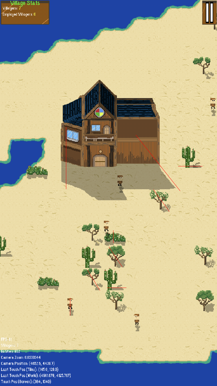
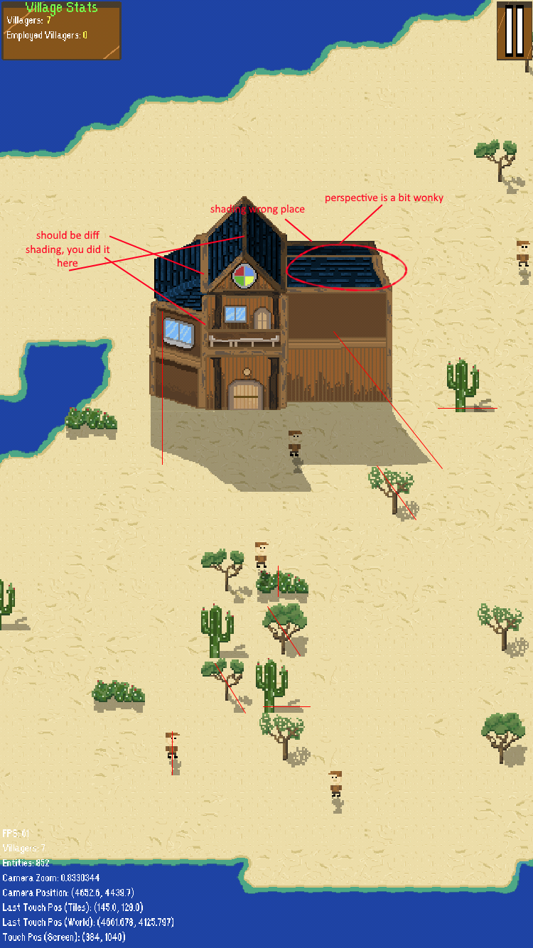
First time pixel artist

Hello!

I’m currently developing a village simulator for iOS - I’m a programmer and have just started doing pixel art a few weeks ago.

I drew everything so far and would like some feedback on the screenshot - particularly in the building. I would love help with knowing what looks good and what doesn’t (talking purely art, ignore UI).Thank you!

Well, it’s already better than my pixel art :stuck_out_tongue:

Cas :slight_smile:

Looks great, particularly considering you’ve just started. Only one negative comment - decide where the sun is! :wink:

Yup! In particular, I think the shadow of the cactus is off - is everything else fine?

Keep in mind I’m not done yet and the empty wall of the building will be filled!

Much better than anything I could ever hope to do.

Thank you for all your support! I’m surprised, too, as I’m a programer who has always ignored art.

This is purely from the standpoint of someone who enjoys their straight lines & hard corners: the window on the left of the building looks a little off. Other than that, I actually find myself enjoying the setup you have going here!

If I might make a suggestion (it certainly made sense and helped me when someone pointed it out) I learned how to use Blender for incredibly basic stuff, and it really helped me to start drawing things with accurate perspective. Maybe something like that can also help you along?

In any case, fine work there, chief.

Hello!

Thank you for the suggestions! I think the window looks off because of the shadows below it but I’m going to work on it.

The game is over a month in production is close to a playable state! Will post updates as they come :slight_smile:

  • Jake

To me, the building, person and bushes have the sun almost straight ahead; the cacti and two of the trees have the sun coming from the left; and one of the trees has the sun from 45 degrees (between left and ahead). Everything with the shadow at 45 degrees might look better?

In fact, could you draw shadow and object separately? Then you could play with different rotations / even move them during the game?

Marked the shadow directions as i perceived them.
The houses shadow seems totally off, i has like 3 different light sources.

EliwoodL made a great suggestion, you could use Blender to create helper lines for accurate geometry and shadows.

I’ll change the plants shadows. As for the house, the shadow on the left doesn’t look normal because the wall isn’t facing the camera (it’s on an angle as you can see) so I wasn’t sure where to place the shadow.

I’d like everything at a 90 degree angle. Going to have another shot at drawing them!

I’m not a pixel artist (or any kind of artist), but it seems that since it’s angled inwards it should let more light through than the other wall. Though if you draw the shadows at 90 degrees with the sun at the left that side won’t cast a shadow anyway.

Only stuff I could find:

Otherwise, it looks pretty damn good. Colored window = spicy

Overall nice work. You might consider adding some texture or animation to the water, like you did with the ground.

I’d also be curious to see how the characters move in the world. Movement is hard to get right, but a general rule is that it should be fun to just move around in your game. If moving around isn’t fun and interesting, then people won’t enjoy playing it.

Hi,

I will definitely add texture to the water.

The character movement is tricky. I have a function that will walk a villager to any point, but they don’t walk in a straight line. They have a “checkpoint system”, where they walk to a checkpoint and then to the next so the movement looks natural. For villagers not assigned to buildings (none of the worker buildings are in the game yet) roam around within a circular boundary and will stop to talk to other villagers. If a villager is assigned to a quarry (in the close future) they will find a rock close by and walk to it, mining the rock and bringing it back!

Hope this awnsers your question!:slight_smile:

  • Jake

UPDATE: Drew the Lumbermill! This building is textured differently (look at the exterior wood). I also spent a lot of time on the smoke stack / chimney, however I don’t feel like the top poke right. Thoughts?


https://preview.ibb.co/mx8qeR/756_C6319_D98_C_4_B79_8918_35872_B89_D903.png

  • Jake

The black circle representing the opening of the chimney is way to large, the bricks cannot be that slim.
Also the chimney is perfectly uniformly round, too round to be believable imho.

The building itself looks really good, better than what i can do!
Only thing that stands out negatively about it, is that the middle part of the wall has no texture, just the same color flood filled into the area.

The phrase "Village Stats should probably be shifted downwards along with the text below it. The text on the dark border seems odd to me. Also, I think the green does not really fit the color scheme. I think white like the other text would work.

Additionally, the pause button looks vertically stretched.

Other than that and what others have said, it looks awesome! I look forward to seeing the game once it’s complete!